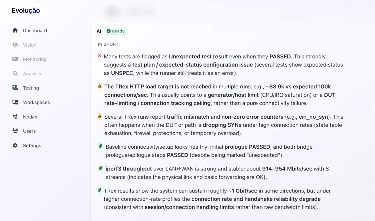
Static code analysis
and software testing
platform
for high-reliability systems
Reduce risk, improve code quality, and gain full visibility across your software stack with software testing, quality assurance and static code analysis.
Trusted by leading engineering teams worldwide
When traditional testing is no longer enough
Large codebases and distributed architectures introduce risks that remain invisible to conventional testing approaches.
Detect risks before they reach production
Modern software spans millions of lines of code, multiple languages and external dependencies. Without deep static analysis and dependency visibility, defects accumulate silently over time.
Our solutions enable compile-time analysis and system-level insight, helping engineering teams eliminate design flaws early - before they impact reliability or compliance.
- Identify code-level issues at compile time
- Maintain reliability across evolving systems
- Prevent security and compliance issues before they escalate
A modular verification system built for complex software
We combine static analysis, distributed testing and runtime monitoring in a single integrated system.
Designed for large-scale and security-critical environments, the system provides full visibility across the entire software lifecycle - from compile time to deployment.
Built for enterprise deployment
Deploy on-premise or in hybrid environments.
Integrate seamlessly with CI/CD pipelines and existing security workflows.
Extend the platform with custom analyzers and domain-specific rules tailored to your infrastructure.
Software testing and quality assurance for complex systems
We provide software testing, quality assurance and static code analysis for complex systems, embedded devices and enterprise software.
Our solutions help engineering teams detect issues early, improve system reliability and ensure security compliance across the entire software lifecycle.
We specialize in testing distributed systems, networking devices and large-scale codebases, combining automated testing, static analysis and system-level validation.
Enterprise services & support
Integration and technical enablement for mission-critical deployments.
Secure software engineering
Building secure software is hard. We are aware of the state-of-art techniques to do that and are ready to lend a hand to you.
Testing & analysis tools
We believe that building secure software is only possible if you control the stack. Complex technology stacks are our cup of tea.
- Analyzers and linters
- Compilers
- Debuggers (+reversible)
- IDEs
- Code generators
- Build systems
Electronics/Networking
We were making many electronic devices. Many of them were successfully launched in the wild.
- Routers and extenders.
- Smart watches.
- Wi-Fi, including Mesh.
- High-performance networking.
- System-on-Chip integration, custom Board Support Packages.
Security audit
Not sure about the security of your software? Our experts may check it for you.
- Defects
- Architecture and composition issues
- Security risks
Ethical reverse engineering
Lost sources? End-of-life driver? We may either help you understand what was going on there, or even rewrite it.
- Any architecture (x86_64, ARM, MIPS, ...)
- Any detalization level
Infrastructure
Is your infrastructure ready for building high-quality software? Setting up Continuous Integration is our daily job.
- Setting up dedicated and cloud servers.
- Any continuous integration solutions.
- Virtual Private Networks (VPN).
Clear structure. Measurable progress.
A transparent engagement model - from initial system review to validated deployment.
System analysis
We analyse your architecture, constraints and risk surface.
Codebase assessment
Deep technical evaluation of code, dependencies and integration points.
Integration design
Definition of analysis pipelines and deployment model.
Controlled implementation
Phased execution with measurable validation.
Ongoing maintenance
Continuous visibility and long-term system integrity.
Built on long-standing systems expertise.
We specialise in program analysis, system integrity and mathematically grounded security research.
Advanced systems expertise
Specialists in program analysis, architecture and security-critical systems.
Engineering precision with strategic alignment
We align deep technical analysis with business-critical objectives.
Built for long-term maintainability
We prioritise long-term reliability over short-term fixes.
Proven in production environments
Our solutions operate in demanding, real-world systems.
Software research & systems engineering
Large-scale code analysis
Security-first approach from day one


Platform access
Structured plans for different stages of product maturity.
Free
FreeFor evaluation and small-scale projects.
- Built-in checks
- Dependency overview
- Community support
Most popular
Professional
Contact usFor growing teams and production systems.
- Extended & custom sensors
- Advanced integrity checks
- CI/CD integration
- Priority support
Enterprise
Contact usFor large-scale and security-critical environments.
- Custom rule development
- Dedicated deployment models
- On-prem / hybrid support
- SLA & architectural support
Insights, events and engineering perspectives
We regularly share thoughts on software engineering, security, research and industry events.
Follow our latest updates, conference highlights and technical insights from the Interpretica team.
Connect
Request technical consultation
What to ask?
- Get a copy of software (licensing questions)
- Questions about the software
- Request a quote for services
Fill in the form
Give us 1-2 business days to respond, or, contact us by E-Mail directly.